


Had you read any of William Golding’s novels before the commission?
I hadn’t, and it’s wonderful to have been given the opportunity to. Of course, many people answering this question would say Lord of the Flies. I read that for the first time this summer and was stunned by its stark beauty and strangeness – but it has been more surprising to discover the other titles which are, in my opinion, equally remarkable and deserving of as much attention. In terms of creating the cover artwork, I think it was helpful coming to the novels without preconceptions and to feel the full impact of the writing. I owe many thanks to Donna Payne at Faber for trusting me with this important commission. Donna came up with the overall concept and striking new design for the novels and her guidance and enthusiasm has made them a pleasure to work on.
How would you describe the feel of this new set of covers?
I would describe the feel as pared-down, dark and symbolic. Faber wanted the artwork to reflect some of the stylistic qualities in Golding’s writing as well as to help reposition him as the radical Nobel laureate he was. With this in mind, we also wanted the images to evoke some of the mood, the deeper themes and symbolism within the writing. Although there are common themes throughout Golding’s writing – mythology, brutality, power, etc. – the novels are, of course, completely different and, importantly from my perspective as an illustrator, set in very different periods and environments. Take the first three titles, for example: The Inheritors is set in prehistoric times, Pincher Martin in the Atlantic during the Second World War, and The Spire in medieval England. One of the big challenges working on a collection this diverse is how to make a cohesive set of images whilst simultaneously highlighting each book's individuality. Taking a more prescriptive approach to the design and illustration, by limiting the colour palette for example, can really help with this and, as many artists know, setting some formal boundaries can help free up the imagination.
Were any of the novel designs particularly challenging?
I found it tricky in the beginning to find a way of creating images that felt natural, that were right for the novels and fulfilled my brief from Faber to adopt a minimalist approach. My usual way of working is more narrative led and detailed, so it was an interesting challenge to distil the images down to this extent. Rather than asking the question ‘What can I add to improve this image?’ it became much more about paring it down and about what I could take away. Allowing myself to use only one or two visual elements (a window, a hand, a ship, a reflection) helped with this and meant it became less about evoking a specific scene and more about creating an enigmatic symbol that required more interpretation. This also became a way of aligning with Faber’s brief of picking up on the allegorical nature of William Golding’s writing. It’s also the first project I have worked on entirely digitally. This wasn’t intentional – I start most projects by reaching for a pencil – however, it felt intuitive to work this way as it meant I could more easily try out lots of different arrangements of forms and colour.
So far Lord of the Flies has been the most challenging simply because it’s the most famous and already has so much imagery connected to it that everyone knows, whether from films or previous book covers. When a story is famous and has been visualised so many times before it makes it harder to come up with a new approach. One option would have been to work with an image from the novel that hasn’t been used on the cover before, for example the parachute or the fire on the mountain top, however, one cannot ignore the fact that the well-known imagery resonates with people and is powerful for a reason. In the end it became a question of how to work with that imagery, in this case ‘Piggy’ and his broken glasses, and present it in a different way. I think I tried around thirty different versions in total. I’m pleased with the chosen design. It nods to the cultural status of the book whilst emphasising the stark brutality and horror of the novel.
Did you feel there were challenges of rejacketing a well-loved classic with broad appeal?
Yes, absolutely, but again I think it helped coming to the novels with a fresh pair of eyes. I’ve grown to love his writing through working on this commission, however, had I come to it already a Golding fan I think I would have found it much harder – too much pressure. I received a carefully considered brief at the beginning of the project containing a detailed synopsis of each novel outlining key themes and characteristics, which was extremely useful. I also had a lot of support and expert guidance along the way both from Donna Payne at Faber and the Golding estate. It was a group effort but, crucially, a small, mutually supportive group working together closely. I was given excellent direction, as well as freedom to explore and interpret the novels, which is important.
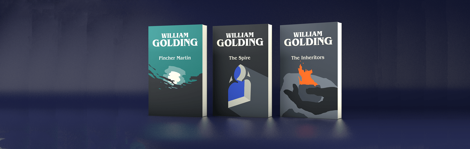
The first three titles we're reissuing are The Spire, The Inheritors and Pincher Martin. How did ideas for these three come about?
I worked on images for The Inheritors first. This is where I worked through a lot of the challenges mentioned above and the final illustration for this cover set the tone for the whole series. It’s an extraordinary novel centred around a Neanderthal tribe. There’s a female elder who is the keeper of the fire and carries the embers in a small clay crucible. I played around with lots of ideas and compositions which centred more on the landscape at first, but I loved the image of the fire in the elder’s hand. There was something powerful and symbolic about it, both primal and human. The fire and the hand on its own were a little too sparse so the cave entrance was added at a later stage to provide some context, and the feeling of coldness in the background contrasted well with the heat of the flame.
The image for The Spire was more straightforward. I tried some other images looking up at the silhouetted tower surrounded by scaffolding, but again, the symbolism of the window and the duality within the image, of light and dark, external and internal, were more fitting with the themes of the book.
The hardest of the three to get right was Pincher Martin. In some ways it should have been the easiest as I’ve created many illustrations over the years set during the Second World War. I had two main directions: the first played with various views of ‘the rock’ (the island) and the second with underwater views of a drowning man looking up towards the surface. I liked this second image. Perhaps ‘liked’ is the wrong word: it had a dreamlike quality. However, looking back, the feedback I received was correct. It was overly figurative and didn’t sit as well with the other two covers. In response I decided to simply try it without the figure. This had the effect of taking away the objective viewpoint and instead we see the scene from the position of the drowning man. Curiously, this made it a more mysterious and contemplative image. I worked a lot on the colours, too, for the first three, creating a palette I could use across all the books.
Finally, do you have a favourite amongst the new book designs?
Of the first three, I think Pincher Martin is my favourite, but I’m still working on the images for the next covers. It’s been helpful to reflect on the process at this stage in the project actually – thank you!


