


Senior Designer Pete Adlington gives a behind-the-scenes insight into the process of designing the cover for Klara and the Sun, Kazuo Ishiguro’s first novel since he was awarded the Nobel Prize in Literature 2017.
Klara and the Sun is, in theory, a science-fiction novel, narrated as it is through the voice of Klara, an Artificial Friend who has been built as an AI companion for children. The Sun acts as a character in Klara’s world, looked to for guidance and to recharge her batteries (in the literal sense, rather than two weeks in Benidorm). Ishiguro uses Klara to provide a unique observation on human character and, so, it reads far less like science fiction and more like an exploration of what it is to be human – a term that has been flogged to death on a million blurbs, so forgive my laziness in using it here. It’s a very warm novel, simply narrated with care, as Ishiguro is so adept at doing.
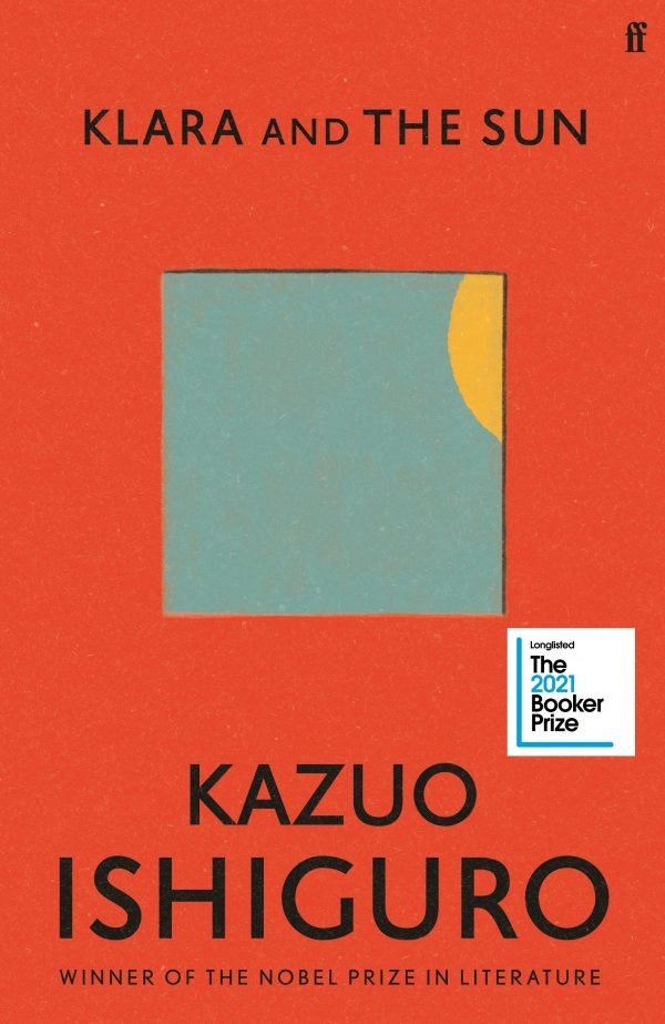
The brief was fairly open, with some passages pulled out to give a flavour of the book. There was emphasis put on creating a design that could easily translate to a big marketing campaign. I wouldn’t say that I gave this a massive amount of thought as I began the design process, but I did want to create a jacket that was simple and held a central motif that was quickly recognisable. (These two traits certainly make it easier to produce campaign assets down the line.) What I was aiming for was something that amounted to the ‘big book look’, a style which designer Paul Bacon is credited with creating, and defined by Steven Heller in his excellent article on Bacon as ‘large, bold title, prominent author’s name, small conceptual image’. It might sound conceited to be knowingly designing to a template for commercial success but it was inevitable that I’d have been steered in this direction and so, for me, it was easier to accept that at the start and try to create a pleasing design within those parameters.
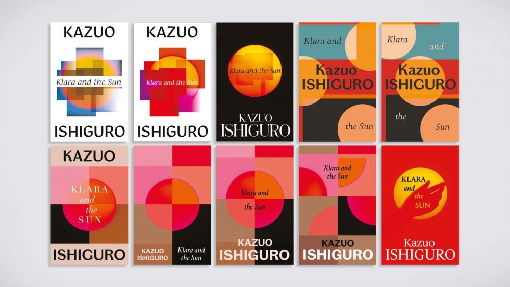
Better designers might have pulled out a brilliantly unexpected motif to represent on the cover but, for me, featuring the sun felt like the correct thing to do. It’s completely ubiquitous and speaks to all people. Klara’s relationship with the sun gives it an unusually playful character: it’s both a symbol and a protagonist. My initial visuals tried to do little more than present the sun in fragmented compositions; on initial glance, they’re purely abstract aesthetic (last visual using a hand, aside) but it also pertains to the mechanics of Klara’s vision, which would hopefully become clear to the reader in the early stages of the book.
The bottom left was liked but when we approached Ishiguro for his initial thoughts, he was concerned about the similarity between this route and the composition of the Japanese flag, something he was keen to avoid. Taking this into account but unwilling to lose the sun, I produced some visuals that used it in a different way.
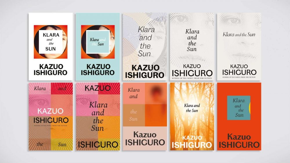
The next round saw me mainly trying to use a partially redacted image of a girl. Steering away from presenting the sun as a full circle, I used expanding rays to hold the image. If the girl is Klara, she is consumed by the sun, existing only where the light falls, which could signify her dependence on it. This route, especially the cleaner version top right, was liked and felt to be worth developing.
Conspicuously, the final route makes its first appearance here and, if I’m honest, I produced this thinking that it was maybe too simple to be the cover. I liked the concept, with the sun playing hide and seek with the viewer, and it went a long way to having the ‘big book look’ mentioned earlier but, at this point, I wasn’t confident it would go any further. Contrary to my initial feelings, though, it was strongly liked and was brought forward with the redacted portrait to the next round.
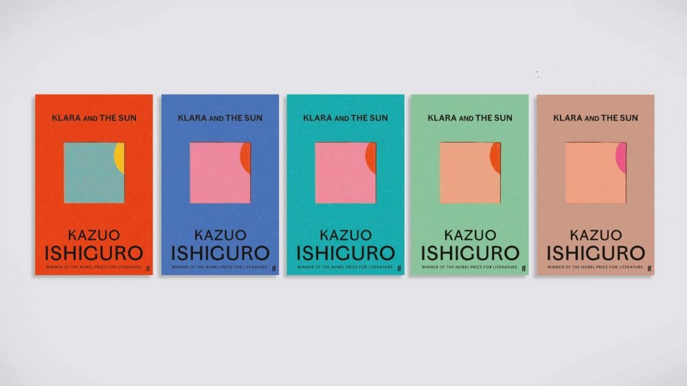
Nice as they were, the spare white covers didn’t really stand a chance against the more shouty confidence of the red, blue and yellow. In this round, I’d moved the title from the window so you had the clean, central motif I was looking for in the beginning. Red was a clear favourite in-house and, inevitably, I was asked to provide colourway options.
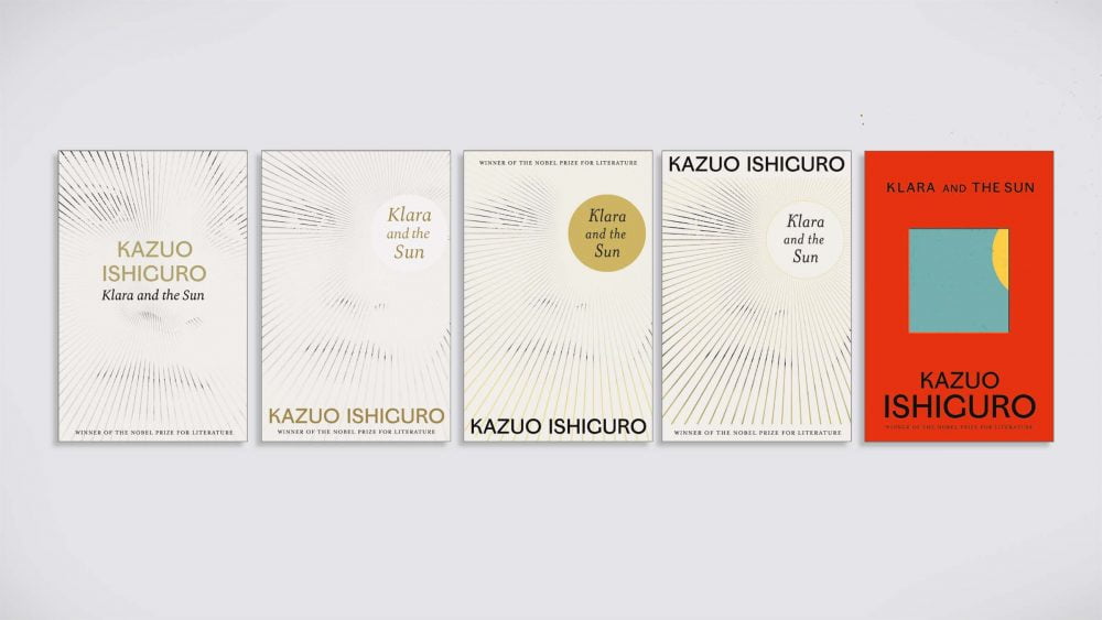
Alongside the differing colourways, I executed the cover in a painterly style, so it had a more childish/naïve feeling. It was important that there was a softness and a warmth to the cover, to match Ishiguro’s writing style, so giving it a more crafted execution removed the chilly, digital feel that I felt was holding it back in the last round.
As we know, red was approved (with an amend to the typeface) but I really loved some of the other colourways. In the end, we produced special editions both for Waterstones and independent bookshops, which allowed me to use the turquoise colourway for the independent edition.
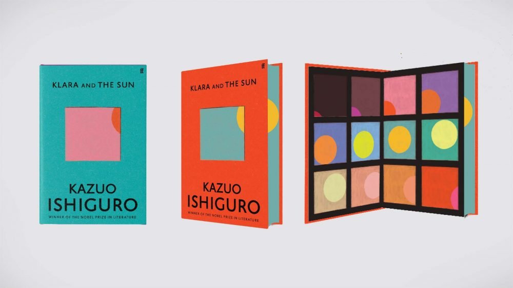
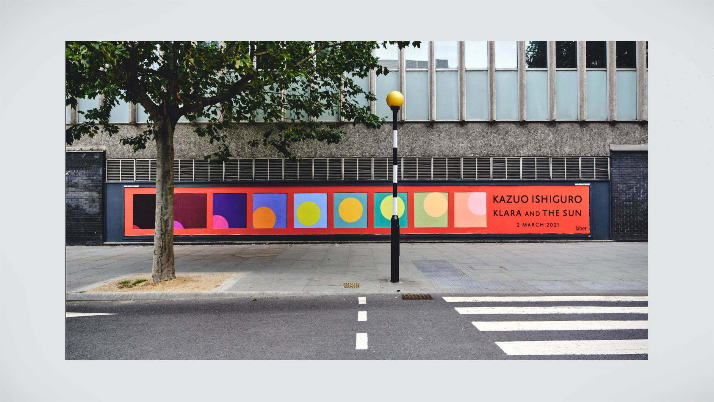
The Waterstones edition kept the original cover but included printed book edges, carrying the window design which, if angled right, you can imagine there’s a whole sun floating there. It also had unique endpapers inspired by the colour work I’d done, so it was a useful exercise, made further useful as the panels in the endpapers were again used in a large-scale poster to reveal the publication.
I mentioned earlier about the design needing to work well throughout the campaign and this was just the start of a large number of creative print and digital assets that the campaigns team produced using the cover.
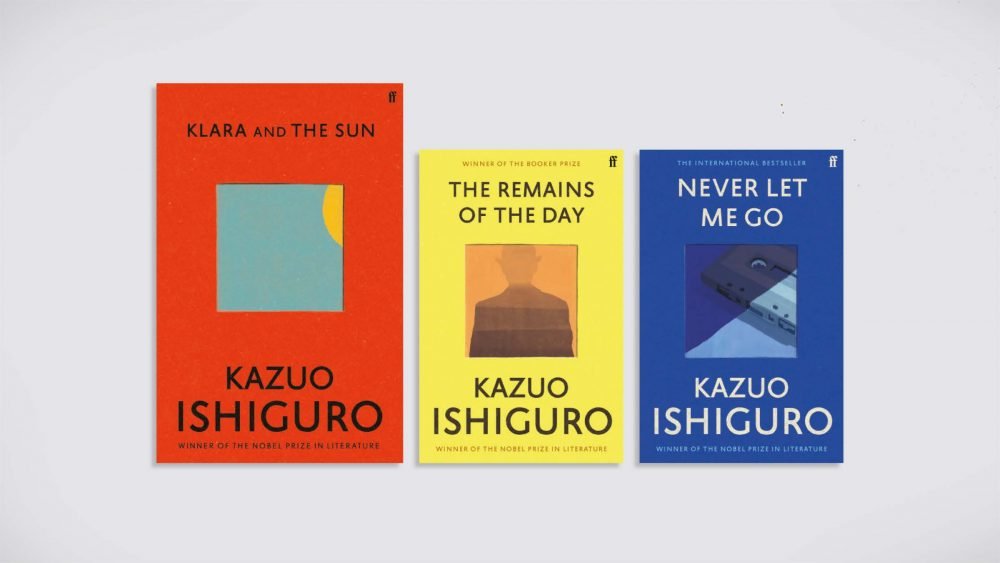
Having had the cover for Klara approved, it was decided to quickly re-jacket The Remains of the Day and Never Let Me Go in the same style. I kept the window device as well as the typeface for continuity and produced a number of illustrations for the panel. These illustrations were simple and pared back but they offered more narrative than the semi-circle and square for Klara and the Sun.
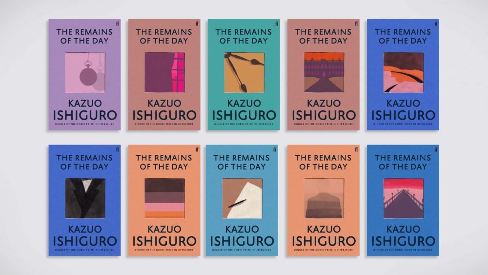
I made a large number of options for Ishiguro to choose from for each title.
After a couple of rounds, Ishiguro made his choices in both illustration and colour and the three books were complete as a set. Special mention should go to Jack Murphy in Production, who worked tirelessly to get the physical books looking as I imagined. Designers take most of the credit in how a book looks, but this was a truly collaborative process that took months of trial and error.
Klara and the Sun by Kazuo Ishiguro is out now in hardback, ebook and audio.
Klara and the Sun is the first novel by Kazuo Ishiguro since he was awarded the Nobel Prize in Literature 2017