


At the heart of Britain lies a non-Euclidean knot of fathomless dread. (Anyone familiar with The Wicker Man, A Field in England, the children’s books of Alan Garner or the recent Brexit saga, etc. will know this instinctively.) Robert Macfarlane wrote about this phenomenon in an [outstanding article] from 2015, and Mark Fisher delves into the cultural and political aspects of it in his book The Weird and the Eerie (Repeater Books).
But the profound eeriness of the land assumes a slightly different aspect in the home counties of South East England, where darkness of any kind goes largely unacknowledged. The effect is arguably more unnerving in the homely rolling hills of the commuter belt. When pitted against the absurdly boring details of middle-class life, this disavowed force becomes somehow weirder. The settlements arrayed around London face inwards in two senses: inwards, toward the capital, and inwards toward themselves. This double sense of inwardness, guided by professionalism and myths of English propriety, is part of what makes so many of these outwardly pleasant settlements feel so airless and claustrophobic.
Max Porter’s Lanny takes place in one such village. The frantic matrix of life (as it used to be, before coronavirus forced us all indoors) is portrayed as a vibrating salmagundi of catalytic converters, e-cigarettes, Wi-Fi passwords, Twix wrappers, police vans and so on, and sits atop an old land creaking with memories of meaningless violence; a land dedicated to seething regrowth and decay; a land, as the self-styled ‘Deep Topographer’ Nick Papadimitriou might put it, ‘steeped in an entirely different time system’. For Lanny, the little boy at the heart of the story, slipping through the gaps of the noisy human world and accessing these timeless, primal flows, is not something he is simply able to do, it is second nature to him.
This kind of earthy, mystic weirdness is what I was hoping to convey in designing the book’s hardback jacket. The aim was to situate the book somewhere between modernist reduction and folkloric totem. For the paperback, however, it was decided we should take a more literal approach. Shorn of its darker subtexts and wild paganistic trimmings, Lanny is ultimately a story about childhood, nature and growth.
On a practical level, Marketing were keen to follow on from Porter’s debut novel, Grief Is the Thing with Feathers, by having a single image or icon to use across all their graphics. Grief’s crow, illustrated by my brilliantly skilled and aptly named colleague Eleanor Crow, made frequent appearances on marketing materials, perching on the edges of title type. The cover for Lanny needed an element that was equally meaningful and could be put to work in a similar way.
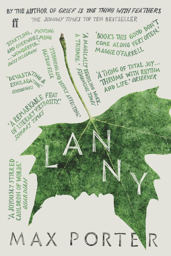
The leaf in question.
During one of my lunch breaks I went for a walk in Bloomsbury Square and picked up a fallen leaf from one of the area’s many Plane trees. When I got back to the office I scanned it and experimented with different compositions and treatments. As is often the way with creativity, I don’t really remember deciding anything. I found myself carving a boy’s profile into the side of the leaf and it seemed to work well. At its most literal, this is an image of a child who is not there.
This design was a response to the brief’s request that the cover should be able to hold as many promotional quotes as possible. It was developed in tandem, but separately, from the leaf design. The hand lettering here is based on the shapes of Sandrine Nugue’s typeface Infini, the main typeface used across all editions, but here it is intentionally much more sloppy, and twists and turns to echo the text design of the village chorus from inside the book (set by our text designer, Kate Ward).
During all of the work for the paperback, Waterstones were pressing for an exclusive, limited-edition hardback in time for Christmas. This would need a different cover from the original, and one that felt more visually generous than the original, brittle, monochromatic hardback. After much to-ing and fro-ing it was decided that we would use the forthcoming paperback design, but overload it with foil and rich tones. Prefiguring the paperback with a seasonal edition felt like a nice touch. Once the Waterstones edition was taken care of I focused my energies on some final amends to the paperback cover, namely the introduction of a bright colour (as we would be publishing in spring) and redrawing all of the cover quotes. I sometimes wonder if masochists are uniquely suited to design.
A devastating story told with the anarchy, the humour and the enchantment Max Porter’s readers will recognise from Grief Is the Thing with Feathers