


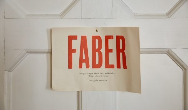


The title of this book – See What Can Be Done – is not a boast but an instruction.
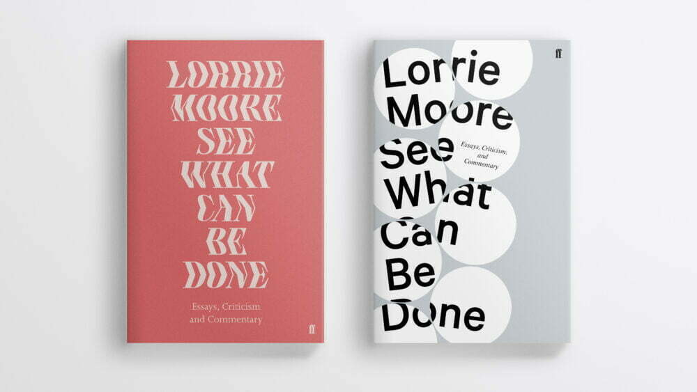
Designing the cover for Lorrie Moore’s See What Can Be Done: Essays, Criticism, and Commentary was one of the first jobs I was given after starting at Faber & Faber in September last year.
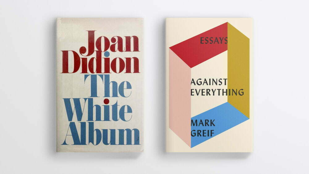
The brief from the editor requested a ‘fresh, distinct look’ for the collection, so as to appear ‘clean, sharp, timely and yet classic’. Joan Didion’s The White Album (designer unknown) and Mark Greif’s Against Everything (by Kelly Blair) were offered as two comparative titles.
I began by reading the essays out of order, jumping between subjects and decades; from John Cheever to Lena Dunham, DeLillo’s Mao II to Friday Night Lights (a soap opera about American football). One gets a strong sense of Moore’s particular way of viewing the world but there is no didacticism and we feel free to re-interpret her interpretations.
My first impulse was to represent the giddy breadth of Moore’s subject matter in a sprawling collage, but as I started looking for images I realised this was pure folly. Clearing rights for the amount of images I wanted to use would not only be a nightmare but also outrageously expensive. And just as important as practicality was the question of tone. Moore’s scope is sweeping but focused, her ideas weighty yet floating. A collage, as I was imagining it, would be too literal and too chaotic.
I wondered instead if it was enough to find a tasteful colour palette, a nice font, vaguely allude to the act of writing, and leave it at that.
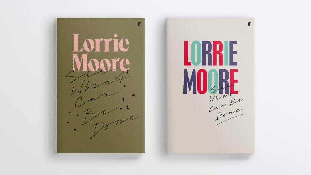
As pleasant as these designs were, both I and everyone in the meeting decided that they weren’t communicating any of the playfulness and criticality of Moore’s writing. ‘Nice’, it turned out, wasn’t enough. Perhaps the content or form of the essays was less important than authorial intent.
To get a better idea of a book it’s normally a good idea to read more of it. Instead I stopped reading. Or rather, I shelved everything except the introduction where Moore outlines her process, the relationship between author and critic, and her feelings about this relationship.
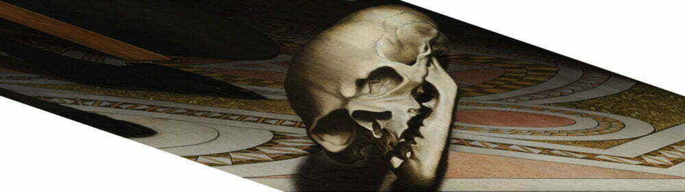
At one point she observes that ‘circumnavigating a thing . . . is sometimes a useful approach’ which seemed to recall Lacan’s assertion that ‘the work of art always involves encircling the Thing’. This lead me to a chapter in Steven Z. Levine’s Lacan Reframed: Interpreting Key Thinkers for the Arts in which the skull that’s hidden in Holbein’s famous painting The Ambassadors is used as an example of distortion’s ability to suggest the existence of something beyond the symbolic (this is a gross oversimplification of an idea that I still have difficulty wrapping my head around, but hopefully this gives some idea of the underlying principle).

The introduction’s closing lines indicate that Moore shares this desire to signal the existence of a hidden or inaccessible ‘Thing’:
A little light, a little wonder, some skepticism, some awe, some squinting, some je ne sais quoi. Pick a thing up, study it, shake it, skip it across a still surface to see how much felt and lively life got baked into it. Does it sail? Observe. See what can be done.
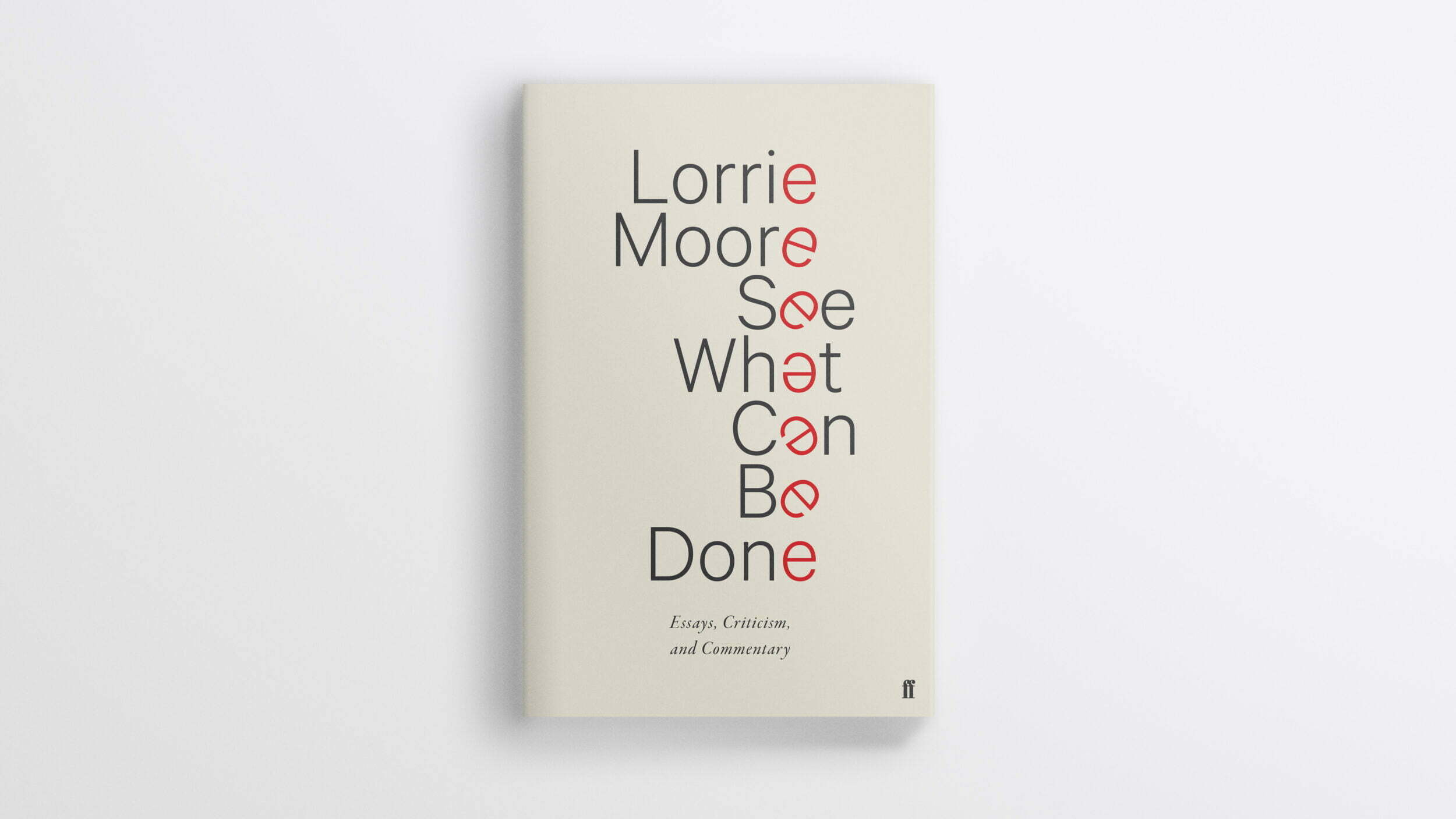
In this spirit I wondered what could be done with the words ‘See What Can Be Done’ themselves. The reflexivity felt appropriate to the book and alive with possibility, so I began by experimenting with angles: Ellmer Stefan’s Kink typeface suggested multiple competing perspectives, whilst another approach involved rotating different sections of the cover in an attempt to suggest the act of turning a collection of objects over in your hands.
Neither of these seemed particularly well developed to me, though I felt like things were moving in the right direction. The second had a kinetic quality to it that I liked. I tried breaking things down further, to get the letters to fight against themselves without sacrificing meaning and legibility.
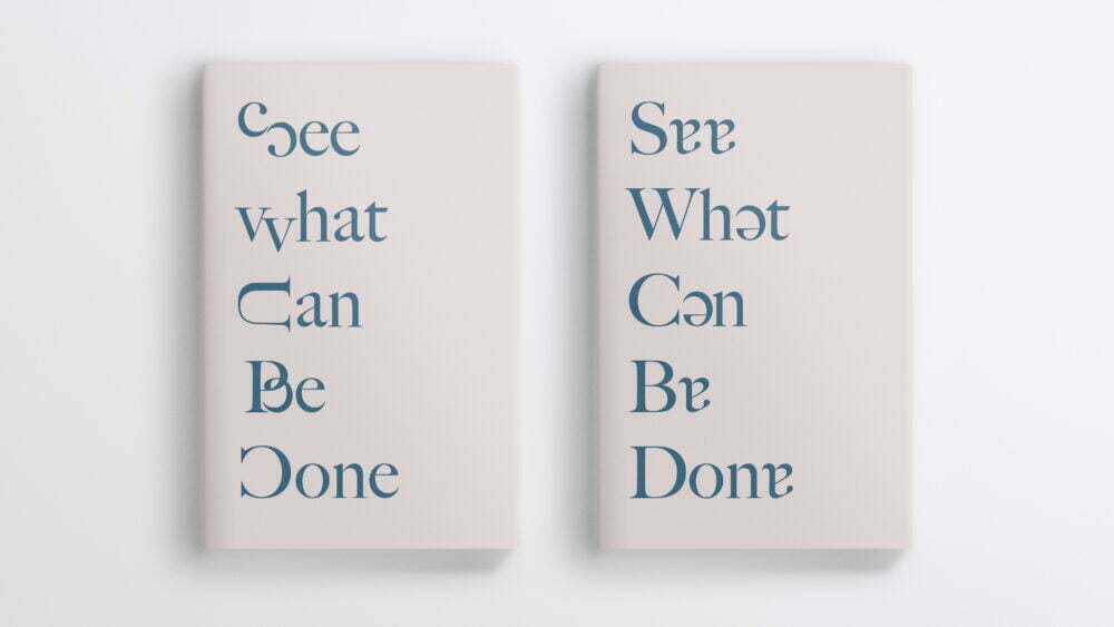
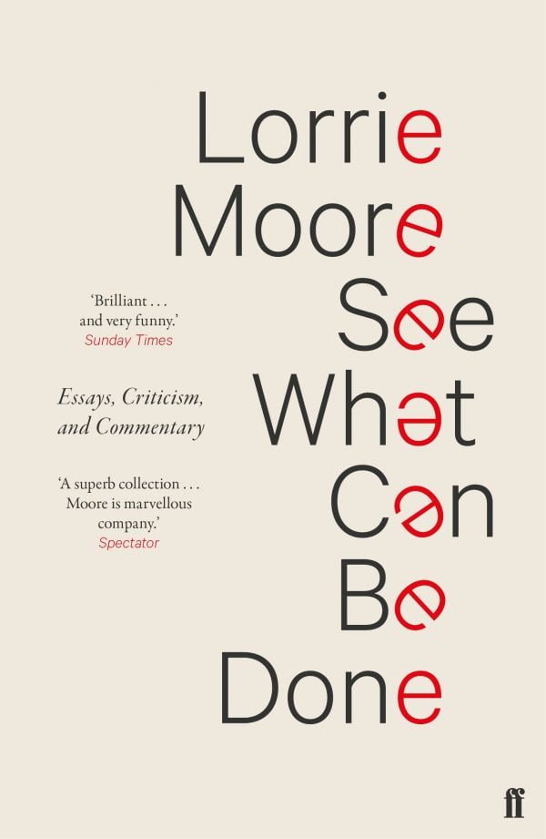
Whilst making these sketches I noticed that every word contained either an ‘a’ or an ‘e’ and that instead of substituting one for the other it might be possible to emphasise ‘process’, as implied in the title, by reintroducing the sense of movement I’d liked from one of the earlier visuals.

The final design was liked by everyone in the meeting, though the author was a little resistant at first. Solutionism is something I’m very sceptical of, so I was sympathetic to what I imagined was her reticence to approve a visual without having seen the process behind it. Perhaps the simplicity felt a little too breezy and convenient. Perhaps she just wasn’t keen on the aesthetics. However, after being presented with some of the experiments above, Moore graciously approved the cover.
The first collected edition of over three decades of exquisite criticism – of art, television, film, and literature – by one of America’s most beloved writers.