


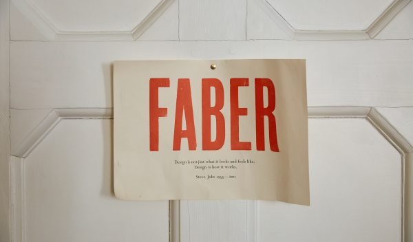


Cover Design: Sleep No More
We talked to printmaker and illustrator, Angela Harding, about the process of designing custom artwork for Sleep No More by P. D. James.
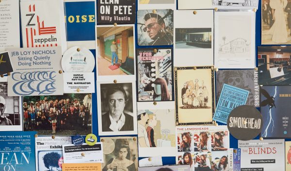
Sleep No More is one of a series of commissions I have completed working with Faber & Faber designer Eleanor Crow. Eleanor is a great designer to work with as she has a very sympathetic approach to the artwork created by printmakers. This was very evident in the nature poet series, I was one of five printmakers commissioned to produce a cover image for John Keats with a given colour palette. I loved the challenge of working this way and the collaborative approach needed to make a series of books work well as a group. This is also true about the P. D. James series, though each cover has be different and distinctive there also needs to be a connection between the different covers.
I always begin a commission with a direct response to the title done in very bad scribbles on any old bit of paper that I then throw away – I just try to get the idea down without overthinking it too much. I will then draw with more care directly on to the block. I use a permanent ink pen and work on to Japanese double sides vinyl. I find working this way make me more decisive and keeps a sense of energy in the cutting.


I use Swiss made wood cutting tools and a magnifying glass. I use vinyl as it cuts so easily and allows the cutting to demonstrate very delicate mark making. I do measure out the main areas for the text that is needed and Eleanor always emails me a black and white of the layout but she is fantastically flexible and very creative herself in moving things around as needed. This might be changing tones to enhance texts or using parts of the image on the inside cover. We also talk about colour and the main theme colour she is looking for, I do generally try out a number of different colour ways and so far we both agree on the best one.
 The slow part of my work is cutting the block – this is the key image that will be printed in black and white. The areas cut are white and the areas left behind hold the black ink – so I am working in negative and a mirror image of the finished art work. When all the cutting is done I print the block on my Albion pres. This black and white is the guide for the colour work. I use this black and white print to trace off my colour areas – each colour is a different paper stencil. I then silkscreen print the colour using the paper stencils. When all the colours are printed I re-ink the block in black and printed over the top of the colour work.
I use a simple paper to paper registration method to ensure all is where it is supposed to be – though I don’t like the registration too tight in the sort of work I produce. I add cobalt dryer to the black ink to help with the drying but Eleanor is very understanding about the timescales involved and quite used to having prints out to dry on her desk before they can be used.
Different colourways for Sleep No More:

Comparing designs for Mistletoe Murder and Sleep No More
to ensure they are working together as a series:

Final covers:


Visit the new website to explore the life and work of P. D. James.