

Cover Design: The Discomfort of Evening
We talked to senior designer Pete Adlington about the process of designing the cover for the Dutch bestselling novel The Discomfort of Evening.
Before I’d received the brief for this title, I’d already heard colleagues throughout Faber talking about it. Those that had read it were keen to find out what the other thought, and often the answer was ‘odd’ or ‘very strange’ or ‘unique’ and then ‘but brilliant’ or ‘I loved it’ or ‘extraordinary’ if they were feeling fancy. If a book already has a swell of expectation before I start to work on the cover it’s usually because it’s a new book by a bestselling author; it’s rare for a work of translated debut fiction to be championed so strongly at such an early stage. Even if, like this one, it was a bestseller in its original country.
I grabbed a proof, read it over a weekend and everything I’d heard about the book was about right. It is uniquely weird and in parts gross . . . but it’s also darkly funny, nostalgic, challenging and so sad. It’s written from the point of view of Jas, a ten-year-old girl whose deeply religious Dutch Reformist parents run a dairy farm in the freezing polder landscape of the Netherlands. It’s a world of fried udders, crow funerals, warts on migrating toads, disturbing sexual fantasies and brutality towards family pets. On top of all this is a thick layer of grief caused by the death of her brother Matthies. Jas’s voice is the real heart of the novel – it’s written in pitch-perfect tone and depicts just what it is like to be a child whose gaping holes in their knowledge of the world are plugged with their freewheeling imagination. Throughout the story Jas refuses to remove her red coat, and this becomes more or less her only constant as the events in her life become more chaotic and unpredictable. She fills the pockets with strange bric-a-brac that she collects – the coat is a powerful device in the novel, one that would help to decide the direction of the cover.
THE BRIEF
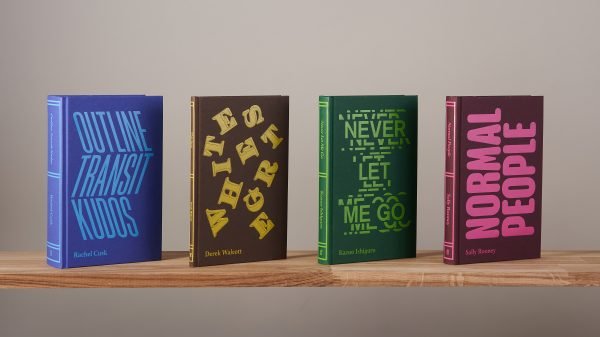
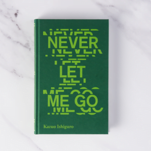
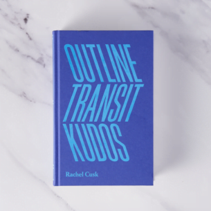
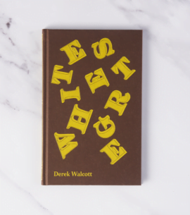
The brief called for ‘A radical design to launch this bestselling Dutch sensation. The cover should be shocking, striking, bold and counterintuitive, stopping bookshop customers in their tracks.’ And some comparison jackets that were seen to have these qualities were provided, as seen below.

My initial thoughts were for the jacket to have a wonky, slightly disturbed feel to it without being off-putting. The book is vivid, with memorable imagery, but much of it doesn’t lend itself to a cover. Being shocking but also appealing and covetable enough to purchase isn’t easy – putting a fried udder on there isn’t going to work (google it) – so I thought in the first instance I’d take common/relatable imagery from the book and distort it.
I started working with clean, graphic images of animals which had detail but were so dark as to feel obscured and threatening. The erratic scaling of them adds a bit of weirdness and depth and the super close-up of the cow’s eye has a manic quality. As I added more animals it didn’t feel like I was saying enough about the story outside of the farm, so I started including items that weave their way through the narrative. A ring pull kept with other items in Jas’s coat pocket, a figurine of an angel, a bar of soap.
I ended up with visuals that presented the story in signifiers, gave clues to setting and definitely looked odd, but the tone didn’t feel right. I thought there was scope in the animals still but wondered if I could render them differently to give a bit more warmth and personality, maybe even humour. I painted some animals digitally on the iPad in a watercolour style and then, when I was happy with how they looked I started to distort them by painting over them with (digital) water so they bled and became mutated, tortured and grotesquely comic. I liked this effect so I worked up a number of compositions, some bringing in Biblical references, that explored how the paintings could work with type and coloured backgrounds.
(The title changed slightly after I’d had it approved – don’t @ me.)

I thought these were decent but I had a nagging feeling that I was probably underselling Jas’s personality and voice, which is the unique feature of the book. Representing a protagonist on a jacket can be divisive as you’re effectively taking agency from the reader. Book designers have a toolkit of techniques to give you just enough without being prescriptive (silhouettes, blurring, cropping out most of the face, hands, etc.), so I thought I’d try a portrait but redact Jas from it in some way. This would serve to let the reader create their own version of Jas and also nod to her need to stay safe behind her coat.
I began by just depicting the coat and eyes. I quite liked where it was going but then never really felt that strongly about it. A pair of detached eyes are hard to love so I decided to push on and draw a complete portrait and see where that took me. In my initial research for the cover I’d found a photograph of a girl by Dutch photographer Jook Oosterhof that for me had a really strong ‘Jas-like’ quality to it. I knew before I started the painting that it needed an unsettling feel to it, bringing the rich colouration from the photograph to the painting wasn’t going to feel right. I depicted her in muted, deathly hues against a dark background, added her coat and put a fair amount of attention into her eyes to make them as piercing as possible. Even though I’d painted Jas’s entire face, the original idea was to redact or obscure her somehow to allow the reader’s imagination to keep a bit of control. I presented two portraits with the animal visuals, one raising her out of the cover, adding a cattle tag for a ‘wtf’ element (with a slight nod to Vermeer), and the other using the coat to hide her away and distance her from the viewer.

The latter was unanimously felt to reflect the spirit of the book: Jas is defiant and challenging but also vulnerable and very alone in a dark place. With some final tweaks to type, dropping the blackletter for more approachable and naive hand lettering, it became the cover with approval from Marieke Lucas.

I missed the cows, so they ended up making various appearances across the whole jacket.

The Discomfort of Evening by Marieke Lucas Rijneveld, translated by Michele Hutchison, published 5 March 2020.


