


Faber: a new visual identity
In 2019 we celebrated ninety years as an independent literary publisher. Stephen Page documents the changes to how we look.
Not only was our anniversary year a celebration of Faber’s publishing over many decades, it was also a timely moment for us to contemplate the future, and consider how we can continue to impact society and culture as we head towards our one hundredth birthday.
Looking back on Faber’s history, while key themes emerge with each decade, it is perhaps most striking that our continuing independence has always been linked to renewal and change – in our publishing, our design, and in how we approach our role as a literary publisher. Our publishing at its best has always sought to combine partnering with writers over the long term with establishing the best minds of new generations. At the heart of our endeavour is the need to ‘make it new’.

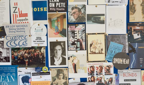
Renewal is about many things, but design – of books, of brand – has a particularly powerful role in communicating change and ambition, and has always been central to our identity. So our thinking in our anniversary year turned to our visual identity, interrogating whether it was strong enough, and whether it represented us now. The growth of key enterprises – such as our Faber Members scheme and our creative writing school, the Faber Academy – posed a question as to whether we were sufficiently joined up. While there is no need for uniformity or rigidity, there is a need for unison. We decided that it was time to change our look and bring new consistency to its implementation.


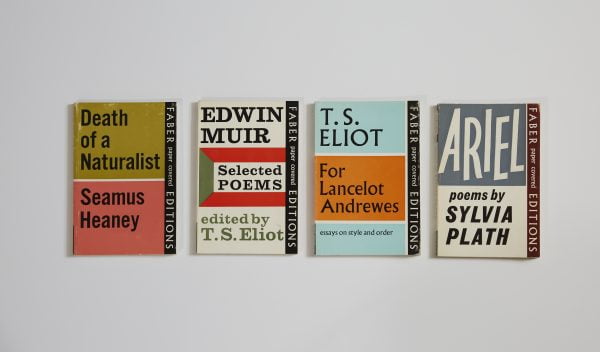
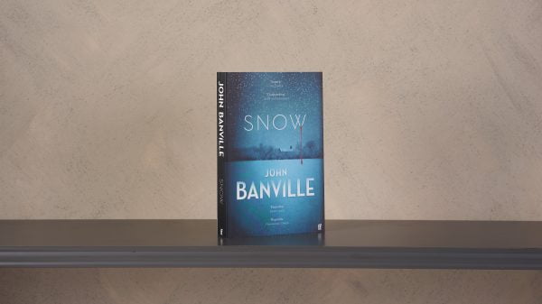
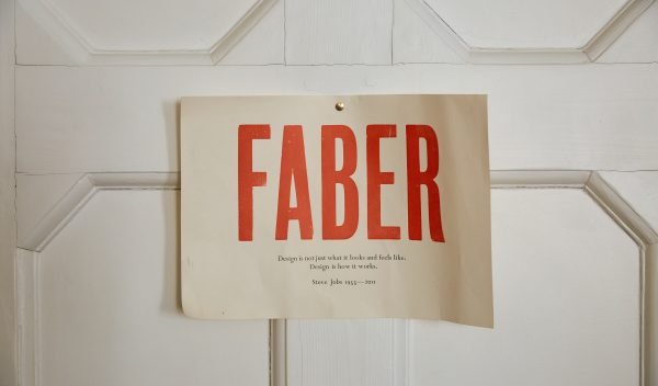
To this end we enlisted the expertise of the brand agency Wolff Olins who aided our enquiry and challenged us in the best ways. Working with the brilliant team therewe made a number of choices. Firstly, it became clear that the colophon remained intrinsic but could also be re-imagined. Secondly, that while looking forward we could also hark back to some of the most distinctive design work and type in our history. Finally, to create fresh clarity and coherence, our word mark should henceforth be simply: Faber. To bring all this together we settled on the boldness and beauty of the Pegasus typeface, which will now be used across all our publishing and platforms.
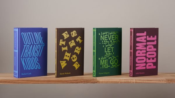
 So this week we launch our Autumn list, a thrilling collection of books for children and adults; and with a new catalogue we begin the process of unveiling our new branding. Over the next few months you may notice some changes to the way we look. In the spirit of our ninety-year history, we’re refreshing ourselves to be as relevant as we can be to the world we are in, and to offer as strong a platform as we can to our writers.