
Illustrating William Golding
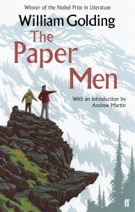
Illustrator Neil Gower writes about creating covers for Lord of the Flies and other Golding titles.
‘It’s like driving an underpowered car: all racing engine, noise, heat and fumes…’
That was my reply when someone asked me recently how it feels to read a book professionally, with the aim of designing a cover for it.
‘…a kind of creative panic sets in. And you can magnify that tenfold if the book happens to be one of the most illustrious titles in the English literary canon…’
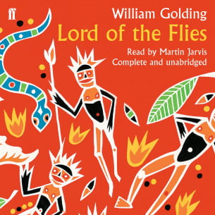
So it was in 2004 when Faber & Faber entrusted me with the task of devising a cover for a special edition of Lord of the Flies to commemorate the 50th anniversary of its publication. Tired imagery such as pigs’ heads and broken spectacles were to be avoided. What was required was a fresh look at the book that also gave, if possible, a reverential nod to its history.
Several days’ reading in, I began to fear that the project was beyond me until, while researching something else entirely, I chanced upon a piece of ancient Aboriginal art.
I swear that when ‘THE idea’ for a design strikes, the reaction is physical. This primitive little painting, with its spikily rendered figures mesmerised me. It seemed perfectly to capture the fragile human tension between atavism and civilisation so precisely wrought in the novel. I could SEE the new design. I would appropriate the style and, among the figures, I would scatter intriguing elements from the text: the fire, the scurrying pigs. A conch shell, barely recognisable as such, might straddle the spine. And, to introduce an echo of its first half-century, I would retain the exact size/positioning of the author’s name and title from the 1954 original, replacing the tangled jungle foliage of Anthony Gross’s illustration with the mass of my new imagery. Rarely have I felt such a forceful, rushing instinct that an idea was right.
However, no matter how strong that gut feeling was, there was no guarantee it could be adequately communicated to, let alone shared by, those who would have to approve it. There followed a week of that unique fear that one’s idea would be rejected because it hadn’t been understood or, worse, rejected because it had. To my relief and gratitude, the leap of faith in me was taken and, from that point on, everything seemed to fall into place. The final artwork just seemed to tumble onto the paper.
So far as I can tell, the cover has proved very popular in the intervening years, winning Best Jacket Design at the British Book Design and Production Awards soon after it came out: a fact which makes it hard to see why, despite my repeated entreaties, Faber still turn a blind eye to the money-spinning potential of a Lord of the Flies Hawaiian shirt in a fabric based on my design.

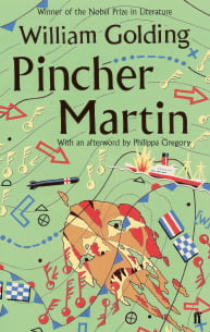
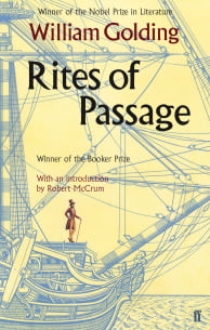
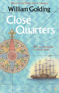
I have since designed sixteen further Golding covers. Each has involved the same loud, lurching drive to completion. From the initial reading and abundant note-taking (first gear):

to rough pencil thumbnail sketches (second gear):

to colour roughs and the wait for approval or otherwise (third gear):

and then the cruise in fourth, painting the finished artwork:

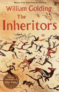
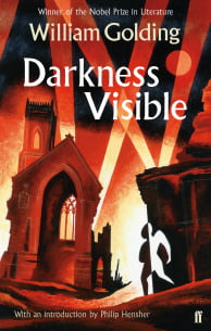
My aim each time was to get as close as possible to the essence of the novel, to locate the germ of the author’s intent in the hope that I might produce something as faithful to it as possible. Darkness Visible seemed to cry out for a design that captured the excoriating positive/negative inversions of its opening passages. A half-burnt child emerges solemnly from the flames of the Blitz, a bomber’s moon sits overhead amongst the searchlight beams setting the tone for the retina-searing imagery that is sustained throughout the book.

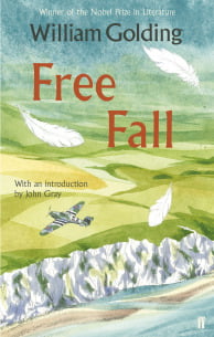
The centre of gravity for Free Fall seemed to lie somewhere in the recurring image of white feathers that fluttered through the novel’s exploration of ‘free’ will and the extent to which it is facilitated or restricted by greater external events. I set the feathers above the layered altitudes of a warplane over white cliffs to provide a sense of the ‘fall’.
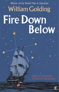
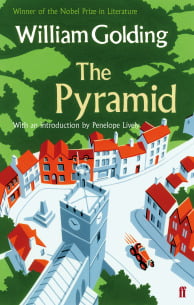
Along the way I learned to trust Golding. He managed to weave the most complex existential quandaries into his narratives, but seldom left one baffled (although I confess I STILL haven’t fathomed that ‘vibrating crystal pyramid’ line in The Pyramid). The insight always came. Whenever I feared that, despite all my revving and gear-crunching, this might be the book that eluded me, he would throw out an almost supernaturally perfect visual cue: the Southern Cross in Fire Down Below, the Nail in The Spire. I will miss him.
The Golding Gallery
And here, together, are all thirteen Golding books with their new covers.

A postscript – As the last five titles are published and my anxieties grow about whether I’ve done the books justice, I have been greatly heartened to read these recent words from Judy Carver – another timely Golding lifeline:
‘I’ve been very touched by the thoroughness with which Neil Gower has approached the task of making fresh covers for my father’s novels. He has sought to be faithful to the books as well as giving us his personal understanding of them. My father wanted his novels to be as different from each other as possible. Neil’s covers reflect that variety and invention and yet have a subtle unity. Like the novels, they are complex, powerful, and beautiful.’
